Friday, June 12, 2015

IT'S A GROOVY WORLD, ALFREDO!!! - FINAL ART!


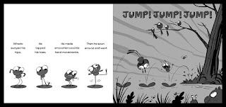
Aaaaaand... here's some of the final art from the book!
I hope you all enjoy reading the book as much as I enjoyed making it. Big thanks again to my agents at Arena Illustration and to everyone at Walker Books for guiding me through my first picture book! I can't wait to do another one!


Wednesday, June 10, 2015

IT'S A GROOVY WORLD, ALFREDO!!! - COVER IDEAS 02!


The next step with the cover was to do a slightly more worked up version based on the feedback from the publisher. I still worked pretty loose at this stage, focusing on graphic shapes and colors rather than finer details. I wanted the cover to be as clear, bold and eye catching as possible, even if reduced down to a small 'postage stamp' size.  


Tuesday, June 09, 2015

IT'S A GROOVY WORLD, ALFREDO!!! - COVER IDEAS 01!


With the inside pages coming along I then also started putting ideas together for the cover (including the back cover).
These colour roughs were my first pass at blocking out some different takes to get an early idea of what direction the publisher would like me to take it in.


Monday, June 08, 2015

IT'S A GROOVY WORLD, ALFREDO!!! - ROUGH PAGE LAYOUTS 03!


The next step was to work up the blocked out colour roughs into slightly more pinned down black and white sketches. I decided to still keep the sketches fairly loose though as I wanted to have room to play around in the clean up. I wanted to experiment with the techniques as I went along without being too tied down, and the sketches provided a structured 'blue-print' to work around. 


From here I leapt, digital brushes a blazing, into the finished art!

Sunday, June 07, 2015

IT'S A GROOVY WORLD, ALFREDO!!! - ROUGH PAGE LAYOUTS 02!


Once we had the thumbs-up from the author and publisher on the sample-spread, the next step in producing the artwork for the Alfredo was to dig into the rest of the pages.
I took my initial colour and shape blocking pass and did a more worked up version of these. I still kept it pretty loose, but I started to refine the rhythm and progression of the colour as well as paying closer attention as to how the text would sit in the layouts.
The most important aspect of the images in this book was to capture Alfredo's physicality and movement, so I attempted to work that into it much more at this stage.
The image above is a 'colour-script' compiled from all the individual roughs (below).