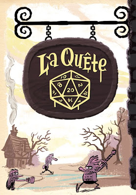
As an excuse to air my dirty creative laundry in public I thought I'd give you a bit of a look at the process behind producing the 2 page comic I just did for Spirou.


First off I sketched out a REALLY rough layout. This gave myself a chance to work out the pacing, composition and because there's no real dialogue, just basically write the thing in drawings.

Next I refined the rough. I developed what the characters look like, posing, expressions and got stuck into more details.
Then I did a rough colour script. At this point I could discuss colour choices back and forth with Etienne who commissioned the piece and land on something we were both happy with.
And then the final piece...
Here it is with Sylvain's strip added around the edges. Hope you like it!! Below are some close-ups of some of the panels.


12 comments:
these are great! I love seeing the process work :)
wow! thanks for sharing this, so cool!
Wow, you're really an incredible cartoonist! Awesome color choices on these panels, and I just love your character designs.
Very awesome! I want to see more of these characters!
The final comic is just fantastic. You nail every panel, the drawings are spot energetic and loose—and Sylvian's border strip just adds to the fun. Clever use of purple there, too.
Thanks for the process, Chris!
WOW,just brilliant!!
Absolutely love it :)
Takes me back to great childhood memories of Groo.
very funny!!
Awesome! I love process blog posts!
fantástico, me encanta!!
Lovely stuff as always fella!!
mp
Thanks for the great comments everyone!
It means a lot coming from such talented artists as yourselves.
crazy'n'clever, as always!
Post a Comment